

It can be frustrating when customers walk into your store, look around, and leave without buying anything.
It’s like watching money walk right out the door.
One reason why this happens is because of your store layout.
Maybe when they come in, they feel like they’re in a maze.
They could be confused and have a hard time looking for what they want.
Store layout plays a vital role in that decision-making process.
In this blog, we’ll explore six effective store layout strategies that can help create an inviting shopping environment and encourage customers to fill their carts.
What is a Store Layout?
A store layout refers to the arrangement of products, displays, and spaces within a retail environment.
It’s how you organise your store to guide customers through their shopping experience.
It starts right from the moment they see your shop window to entering the store until right down to the checkout counter.
A thoughtfully designed layout acts like a silent salesperson.
It can influence customer behaviour and emotions in ways that often go unnoticed.
Choice Architecture: Why Does Store Arrangement Matter?
Choice architecture refers to how the environment, including store layout, influences consumer decisions.
This concept was popularised by behavioural economists Richard Thaler and Cass Sunstein.
They found that small changes in how choices are presented can have a big impact on what people decide to buy.
For instance, if you display complementary products together, like pasta next to sauce, you subtly encourage customers to consider additional purchases.
Research even shows that placing a product at eye level makes it 35% more likely to be bought.
Or as some like to say, “Eye level is buy level.”
It’s not just about putting certain products in specific places either.
It’s about creating a flow that guides your customers towards the next choice and the next ones after that too.
6 Effective Store Layout Styles For Your Business
Studies show that 62% of in-store purchases are unplanned.
That’s right – most people buy things they didn’t come in for.
A big factor that contributes to that is how your store is arranged.
Now, it can be confusing to figure out what layout is best for your business.
So here are 6 effective store layout ideas you can try:
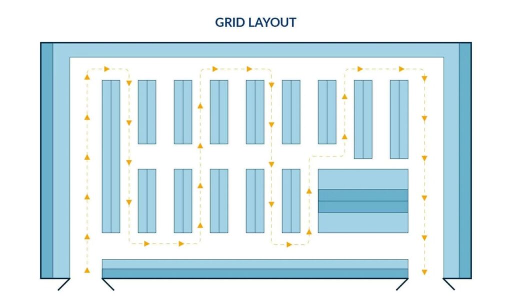
1. The Grid Layout
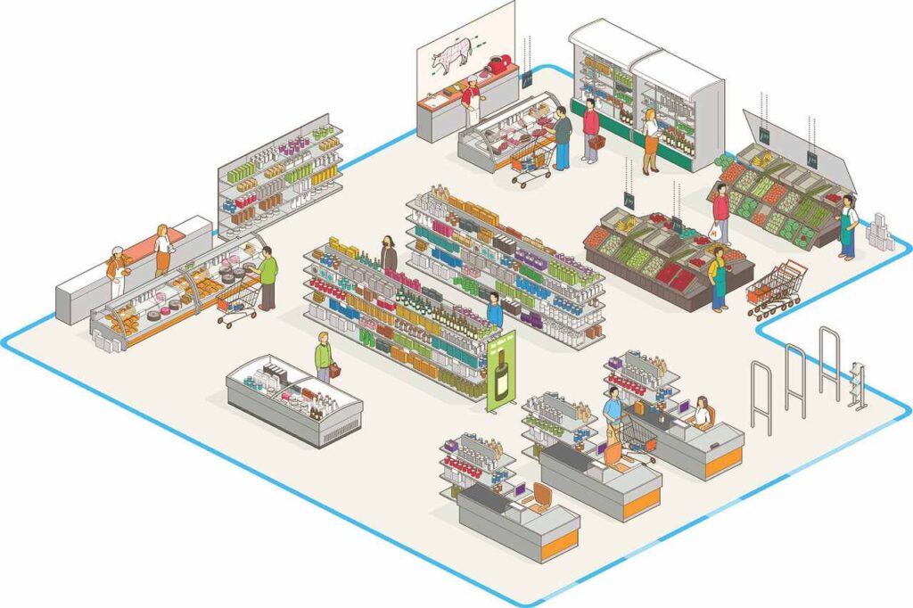
The grid layout is commonly used in grocery stores and supermarkets.
Think of long aisles that run parallel to each other.
It’s designed to maximise the use of space by guiding customers down specific aisles.
A grid layout is suitable for stores with many products because it organises items into clear sections.
Pro tip: Place your most popular items at the back to encourage customers to walk through the entire store
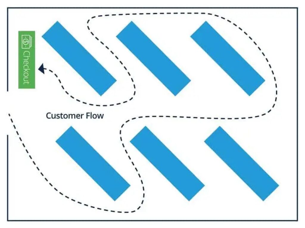
2. Diagonal Layout
In the diagonal layout, shelves are arranged at an angle.
This creates a more visually interesting path through the store.
It also encourages customers to browse different sections as they move around.
It’s often used in smaller spaces like convenience stores or boutiques.
3. The Racetrack Layout (Loop Layout)
The racetrack layout creates a circular path for customers around the store— like a racetrack!
This layout exposes shoppers to a wide range of products and encourages them to explore the entire store.
This is commonly seen in large department stores.
Interesting tip: Studies show that customers tend to spend more time in stores with a counter-clockwise flow, increasing the likelihood of making unplanned purchases!
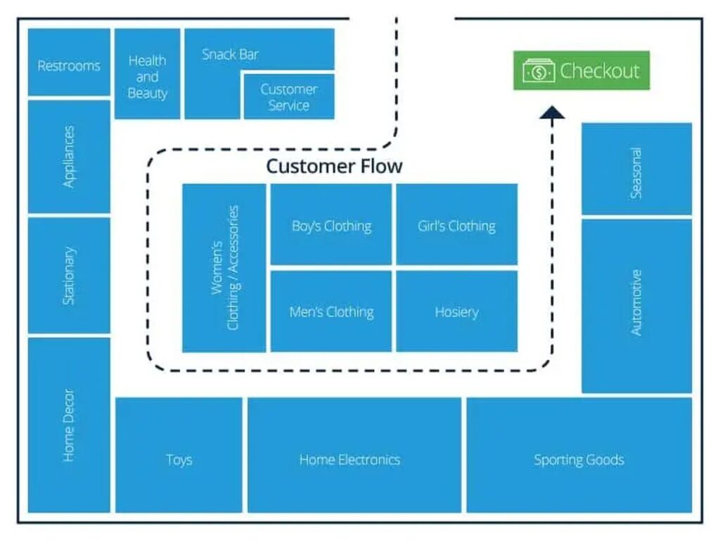
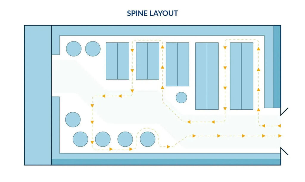
4. Spine Layout
The spine layout features a central aisle (or “spine”) that runs through the middle of the store, with different sections branching off on either side.
This layout allows for clear product categorisation while giving customers the freedom to explore.
This layout plays on the principle of “choice overload.”
It’s when if too many options are available at once, customers may get overwhelmed and walk away.
By keeping the central spine focused and placing only a few categories on either side…
The store feels more manageable and customers can browse around stress-free.
5. Herringbone Layout
The herringbone layout is often used in narrow or long spaces.
A central aisle runs down the store, with smaller aisles branching off like fish bones.
It encourages browsing while utilising small spaces efficiently.
This layout is commonly seen in bookstores or small shops.
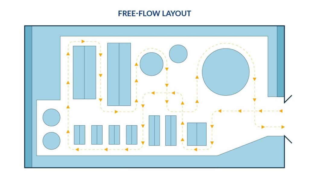
6. Free-flow Layout
The free-flow layout is more casual.
It allows customers to roam around the store without a strict path.
It’s popular in boutique settings or places where the visual aesthetic and experience are important.
This layout encourages exploration, as there’s no set route to follow.
Choose a Store Layout that Maximises The Visibility of Your Products
A good store layout is an essential part of your customer’s shopping experience.
Every arrangement and positioning subtly influences their buying behaviour.
Also, observe how customers move through your space.
Do they pause at certain aisles?
Are there some sections that they completely ignore?
Make their shopping easier and more enjoyable by creating a flow that helps them find what they want and discover things they didn’t know they wanted!
Set up your store layout right, and your space will do the selling for you.
This works the same way for your website!
Especially now in a digital world where online shopping is all too common.
Every physical store should have an online equivalent.
And just like the problem physical stores face with people coming in and leaving empty-handed,
Many potential customers can also go to your website and click away without buying anything or even scrolling through!
While stores can arrange and rearrange their aisles and display cases…
Websites can use the power of words and graphics!
How?
Well, this is why we created our free training called Evoke 5.
This training will walk you through 5 important elements your website will need to turn those skeptical strangers into excited buyers.
We’ve developed it as a step-by-step process so you won’t have to stare at a black screen wondering what to do next.
